
Overview
Dallas College had a long and confusing student resources page that needed improvement. Through research, testing, and ideation, we created a new, concise introduction to commonly used services for prospective students, and a complete listing and filtering tool for current students. The new design grouped resources into categories and used clear language and visual cues to make it easier for students to find what they need.
My Role and Contributions as Lead
UX Strategy
Led
UX Research & Synthesis
Led & Contributed
Workshop Facilitation
Led
UI Design
Led & Contributed
Cross-functional Collaboration
Managed
Stakeholder Communication
Managed
Context
- Pre-COVID, the Dallas County Community College District’s website had a primary page listing all student resources and services
- The pandemic caused quick changes, including hastily reconfiguring this resources page
- College-wide restructuring followed, leading to some services being renamed and new departments competing for space on the resources page
Problems
- User problem: Because the page had “frankensteined” out of control in length, density, and focus, students could not easily learn about or find resources and services
- Business problem: New departments and renamed services required an easy and scalable way to list and market them that did not contribute to worsening layout design
Phase 1
Research & Discovery
Given the above context, I led the team to set out to discover, regardless of this one page, what journey are students taking to find student services online?
- How does this page impact that journey?
- How can we improve this page to help that journey?
- How else can we improve that journey?
UX Research
Usability Testing
- Empathize
- Test
Goal: Understand how students are finding resources and services online from the following start points: Google, Dallas College home page, and old student resources page
“I’m too lazy to read through all this.”
—Student M, 18 (student)
View example of a task
- (Starting from the Dallas College home page) Your instructor mentioned that there is a fitness center on your campus. You are interested in becoming more active and would like to know if it fits your schedule. Find out what the hours are for the fitness center at your campus.
UX Research
User Interviews
- Empathize
Goal: Understand how and when students learn about resources and how they access them, including feedback on the resources page itself
“This page is giving me rolodex vibes.”
—Student J, 23 (student)
View examples of interview questions
- What student services are you already familiar with? How did you hear about them?
- What is your initial reaction to this page?
Research Insights
Insight #1
Visual layouts and elements
When used properly, help students easily scan
Observations
- Students were drawn to the “tiles” layout at the top
- “That’s just a smiling person. How do I know it’s supposed to mean veterans.”
Recommendations
- Use visuals that lighten cognitive load for students
- Provide quick visual cues for the content they represent
Insight #2
Clear language for services and headings
Makes students feel more confident about seeking and getting help
Observations
- There were several phrases and jargon students did not understand
- When skimming pages, students heavily relied on headings
Recommendations
- Contextualize unclear language for students to understand service. For example:
- Add Veterans Services after “Military-Connected Services”
Insight #3
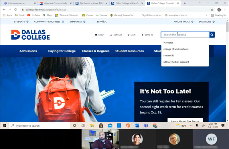
Search
Was used heavily by students when trying to find a service
Observations
- Internal and external search were heavily used
- Students use known, familiar terms instead of proper service or department names
Recommendations
- Incorporate search functionality into solution
- Ensure resources are searchable by known terminology
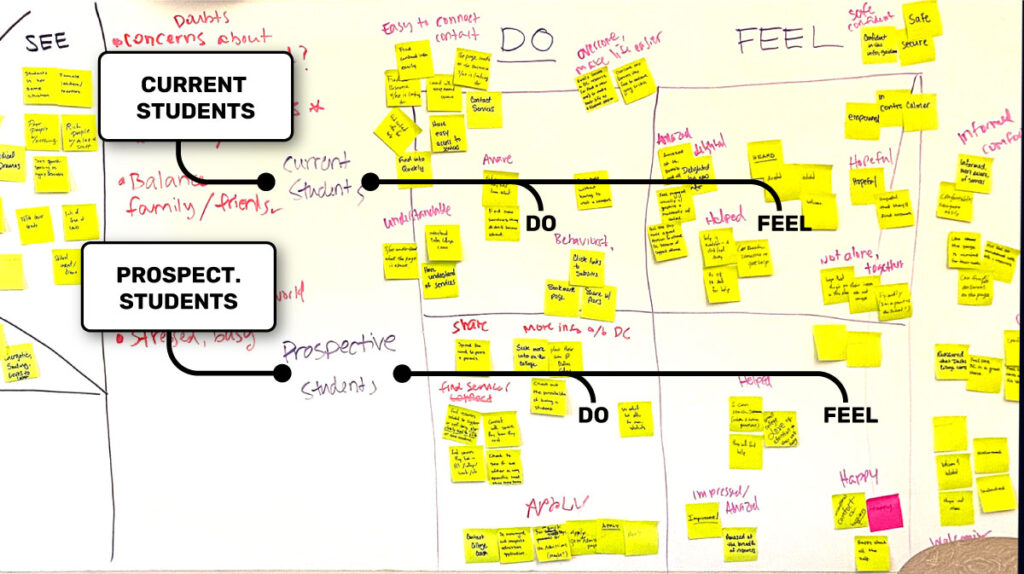
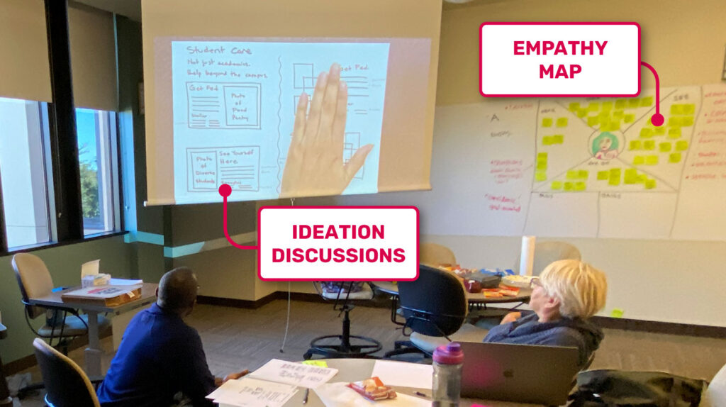
Design Workshop
- Ideate
- Define
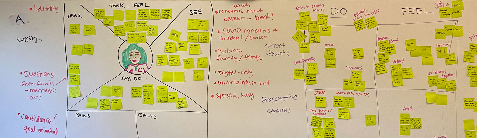
I led a design workshop to clearly distill our audiences, user goals, anticipated challenges, and solution ideation. The workshop activities included:
- Empathy mapping
- Brainstorming
- Dot voting
- Time-boxed sketching
Outcomes for Solution Strategy
Outcomes of initial UX research and design workshop led us to the following strategy for a two-part solution:
Solution Part #1
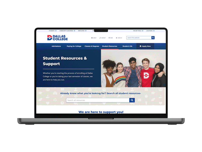
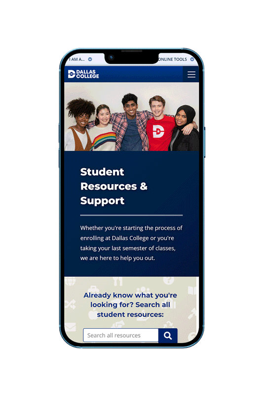
Redesign student resources/intro page that is:
- A concise introduction to must-used services
- Colorful and encouraging
- Intuitively includes links to all resources in part #2
Targeting prospective students so they:
- Feel: welcomed, included, excited, motivated, and confident about Dallas College
- Do: find relevant and needed services, share findings with others, and apply
Goal Metrics: An increase of overall users and visits on all resources pages; an increase of traffic from this page to key enrollment pages
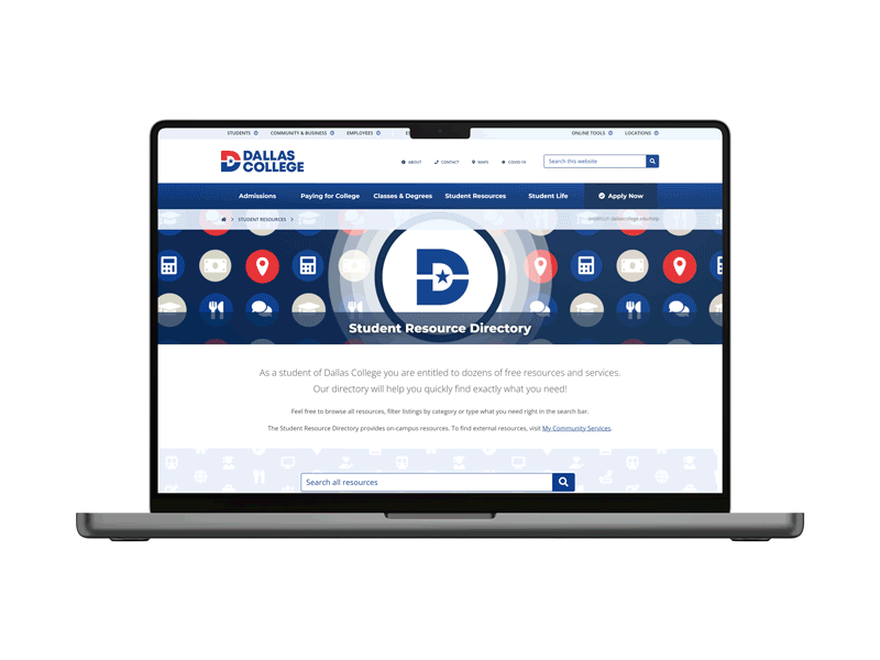
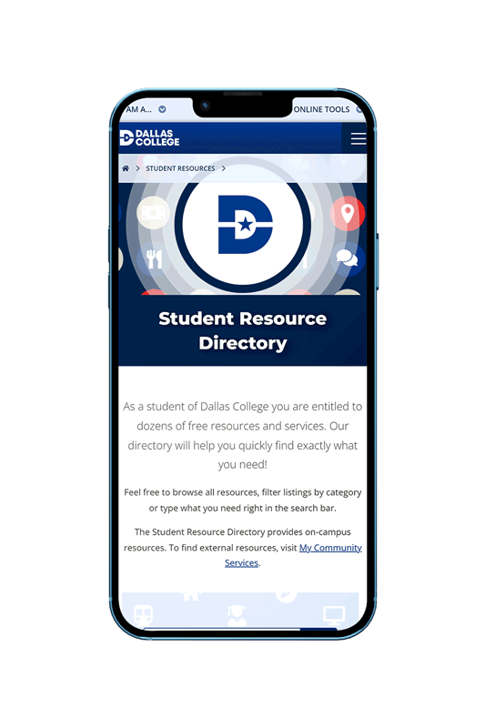
Solution Part #2
Create new student resource directory tool that:
- Uses a clear information architecture of all 70+ resources
- Is searchable, browsable, and filterable
- Provides clear service contact points
Targeting current students so they:
- Feel: safe, confident, and they were not alone
- Do: be aware of all we offer them, easily connect with needed services, and overcome difficulties to make their lives better
Goal Metrics: A decrease in visits that stall and end directly on the resources page; An increase of overall users and visits on all resources pages
Phase 2
Ideation & Design
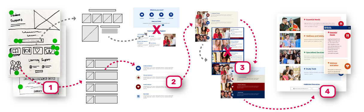
User Research
Information Architecture
- Empathize
- Define
- Method: Open and closed card sorting (online)
- Audiences: Students, student services staff and marketing staff
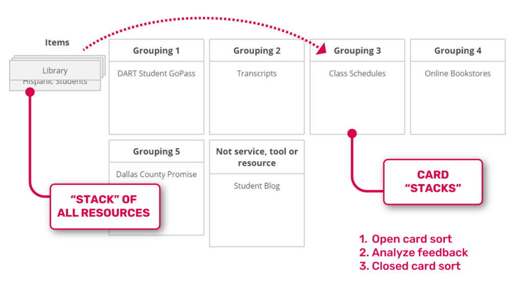
Goals
- Make sense of the 100+ links featured on the page
- Understand which services and naming were understandable and which were confusing
- Distill an organizational scheme for student resources
Unclear Terminology
Examples of terms that both students and staff found to be the most unclear:
- “learning commons”
- “connections team”
- “inclusive excellence”
- “student care network”
Recommendations
Resources should be grouped into six categories roughly about:
- Enrollment (admissions and registration)
- Academic and learning services
- Student basic needs and wellbeing
- Student life and campus activities
- Emotional wellness and physical safety
- Specific audiences (veterans, retired, minorities)
UI Design: Resource Card
- Ideate
- Prototype
The Resource Card component would be how each service is displayed in the directory tool. Here is how the UI evolved:
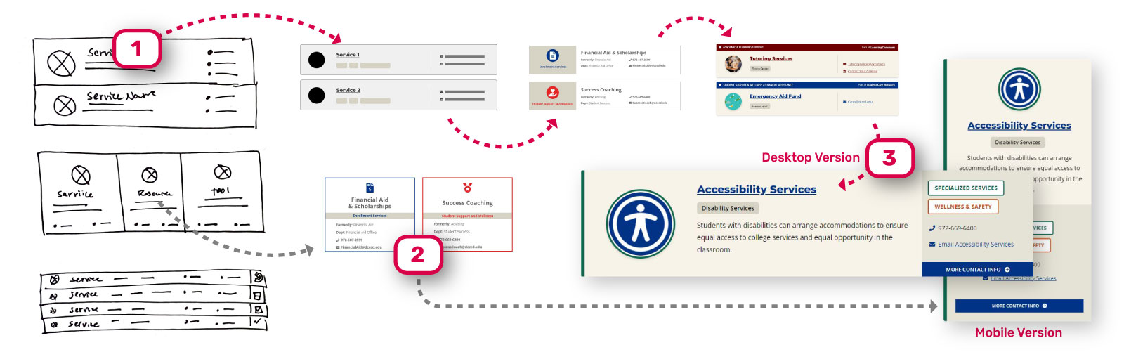
1. Sketching
I started from sketches ideated from the design workshop.
2. Adapting Unused Concepts
Unused sketches and prototypes inspired what became the concept for the mobile version.
3. Hi-Fi Prototypes
I landed on high fidelity prototypes after several rounds of critique and tests with potential users.
View the UI design evolution for the updated support page layout
1. Sketching
We started from sketches ideated from the design workshop.
2. Choosing an Approach
3. Experimenting
4. Arriving
Collaboration
Writing and Visual Design
- Define
- Ideate
- Prototype
The six categories were identified. We needed to find ways to describe, label, and display these categories through copy, colors, and visual.
Copywriting
We collaborated with writers to thoughtfully approach all the copy. They wrote descriptions of all categories and services in plain language and recommended the following names:
- Admissions & Registration
- Academic Support
- Essential Needs
- Wellness & Safety
- Specialized Services
- Campus Life
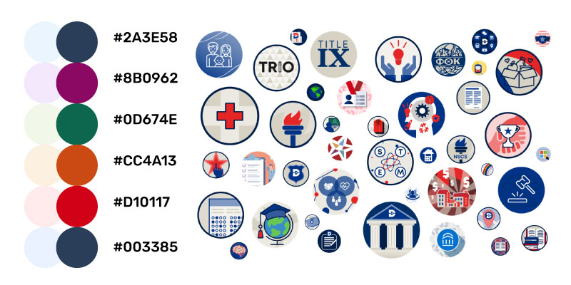
Brand and Visual Design
The brand and graphics team was essential in determining brand-friendly colors for each category and unique “badge” graphics for the 70+ services.
The Pieces Come Together
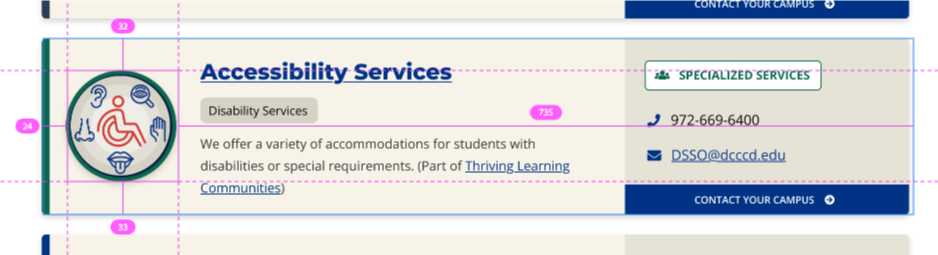
Resource Card Explained
I designed the resource card component so that no matter what name a student may know a service by, that it can be quickly identified. Cards also provide quick phone or email contact points.
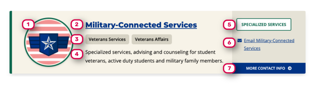
1 – Badge graphic unique for each service
2 – Official name of service
3 – Alternative or previous name(s)
4 – Brief and concise description
5 – Category label with color
6 – Primary contact info/link
7 – Link with additional contact info (hours, contacts by campus, etc.)

Phase 3
Development & Testing
Hand off to
Development
- Define
- Prototype
The XD-built prototypes and high-fidelity mockups that the other UI designers and I handed over to the lead developer made it easy for building and development.
Testing and Iterating
- Empathize
- Test
Nearing completion, we did another round of usability testing to gauge effectiveness. These insights were validated:
- Shorter, colorful design for prospective student page
- Search feature was heavily used
- Featuring small number of resources made it easier to browse
- Clear language and headings were effective
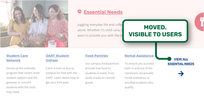
Here is just one example of a n issue that testing uncovered:
ISSUE Example
View More Button
Observations
- The “view more” button under each category on intro page was not noticed. Students believed there were only four services under each category.
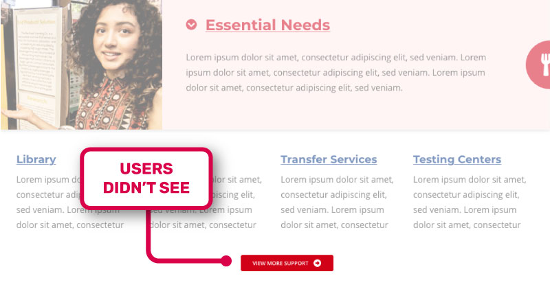
Action
- Component was redesigned to add a prominent link and arrow to show four services were just the start of a longer list.
Results
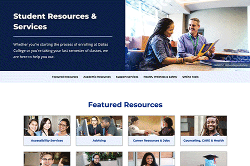
Updated Resources/Intro Page
Launched Product
New Resource Directory Tool
Launched Product
Outcomes and Metrics
Did We Hit Our Goals?
* Visits compared between old resource page (2021-2022) and updated intro page (2022-2023)
** Clicks compared between old resource page (2021-2022) and combined updated intro page and new directory tool (2022-2023)
*** Compared between all resource pages (2021-2022) and all resource pages (2022-2023)
8%
Drop in visits* that resulted in no action
Current students are less overwhelmed by page and engage resources more.
48%
Increase in Clicks** to Key Enrollment Pages
Prospective students feel more confident about Dallas College after viewing the updated intro page and are engaging further in .
26%
Increase in Overall Visits to Resources***
With an increase in visits to all resources pages, students are able to find and access resources better than before.
Lessons and Personal Insights
What Did I Learn?
UX
Human-centered UX projects are possible in higher education web teams with relatively zero resources
Understand and play to your team’s strengths
Workshops are effective ways to align on objectives and ideate approaches
Documenting and sharing research is valuable for internal team reference and stakeholder buy-in