
Overview
I led a project redesigning Dallas College’s homepage to showcase the transformation from multiple institutions to one unified college in 2020. The new homepage met business goals, user goals, and marketing goals, with research and content strategy guiding the process. The redesign also led to faster load times, increased conversion rates, and lower bounce rates.
My Roles and Responsibilities as Lead Contributor
Project Management
I led.
Research & Synthesis
I led and contributed.
Content Strategy
I led, contributed, and delegated.
Workshop Facilitation
I led.
Front-End Development
I led, contributed, and delegated.
Context
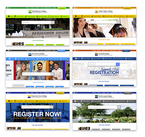
- In 2020, DCCCD (Dallas County Community College District) transformed from seven independently accredited institutions to one unified college.
- New name and updated branding aside, the services and value offered remained the same.
- The new Dallas College home page would need to tell this story in a cohesive and impactful way.
Needs
User needs:
- Quickly and easily find relevant information
- Learn what opportunities Dallas College has to offer
Institutional needs:
- Introduce the new Dallas College brand
- Integrate eight different homepage messages into one homepage
Marketing needs:
- Improve the telling of the Dallas College story
- Continue to to attract, engage, and convert prospective students, community members, and business partners
Phase 1
Research
Analytics Audit
- Empathize
- Define
Before anything else, we dug into the analytics of the legacy home pages, which included heat maps, page exit points, click data, bounce rates, devices, etc.
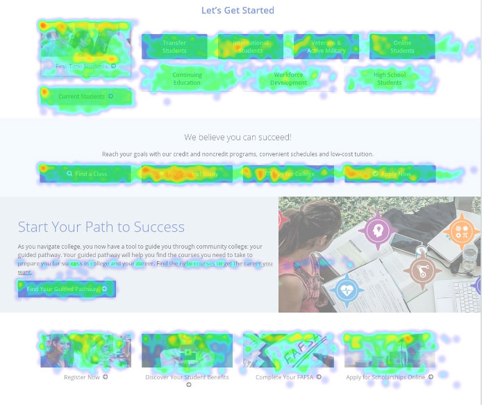
Insights:
- Current students still use the home page: Highest performing links were “Find a Class,” and “Current Students,” which showed more current students used the home page than realized.
- Highly-searched terms needed highlighting: Most searched pages included library, transcript, financial, and advising. How do we enhance access to these pages?
- Focus on relevant info: The lowest-performing content was related to workforce development (business-facing), and our guided pathways program, which signified that this information was largely irrelevant.
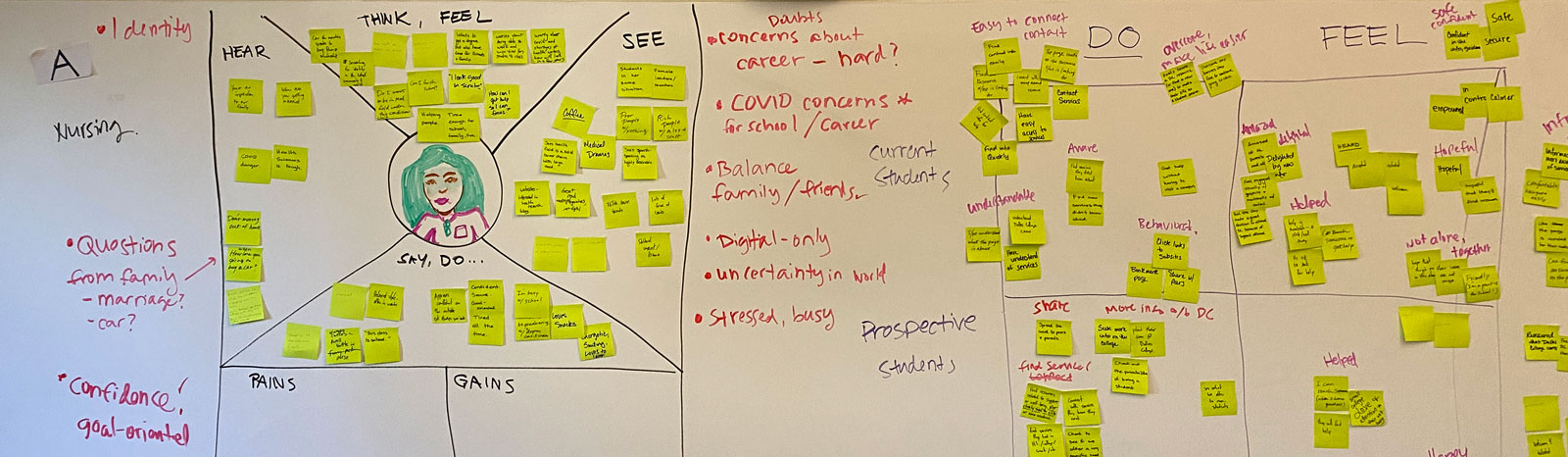
Leveraging UX Research
- Empathize
We had recently done UX research for the redesign of the website header and footer. Part of that research included students doing card sorts of web content by relevance and importance.
Most Relevant or Needed Info
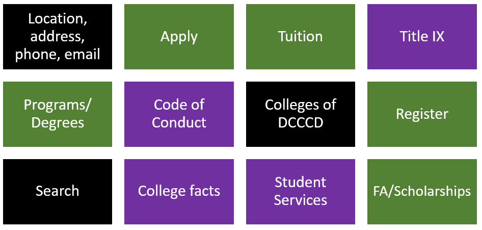
Least Relevant or Needed Info
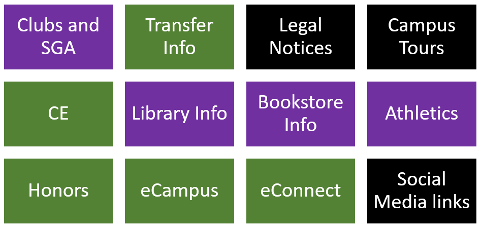
Insights:
- Safety, in forms of diversity, physical safety, and emotional safety, ranked highly for students.
- Therefore, we needed our design (colors and photography) and content (focus on student support and wellness) to highlight diversity and safety
- Contact information and physical location were important.
- Therefore, we needed to include the contact info and map of our locations on the home page to give students that context
- The breadth of program and degree options is valuable to a prospective student.
- Therefore, we needed to capitalize our seven pathways, on the home page and highlight a variety of program options
Phase 2
Strategy
Establish Audiences
- Define
As a marketing department, we realigned on and defined exactly who we were targeting and what questions they would be asking:
Prospective students:
- Do they offer what (classes, programs, training) I need?
- How much does it cost?
- Can I get financial aid?
- How do I enroll?
- Can I succeed?
Current students:
- What upcoming dates or deadlines should I be aware of?
- I need to access a student service and need to know where to find them or who to call.
Community members:
- What class can I take for fun?
- What resources are here for my child?
- How are my tax dollars being spent?
Business partners:
- I need to train my employees.
- What services can they provide for my small business?
- I need to hire new talent for my business.
Former students:
- How do I order my transcript?
- How can I give back?
Establish Content Goals and Crafting the Story
- Empathize
- Define
- Ideate
Based on discussions with marketing leadership and college content experts, we developed goals for what the home page should communicate. In our content workshop, we drilled into those goals and invited current students to our discussion to better understand their perspective. Here is what we articulated about our content strategy:
- Tell the story of Dallas College:
- To demonstrate how our institution transforms lives and communities
- To inspire, motivate, and encourage students to learn more about us
- To declare that we serve every student, every place, and every time
- Show what we offer:
- To introduce what (classes, programs, degrees, training, enrichment, or services) we offer (and its relevance to them and their goals)
- To provide key calls-to-action to move them toward enrollment/conversion
- Express quality and relevance:
- To communicate the caliber and quality of our education, initiatives, and institution
- To introduce how we are relevant to the Dallas County community and workforce
- To communicate plainly and not overwhelm
- Reduce, simplify, and streamline content
- Update visuals using color, infographics, and real student photography
Phase 3
Design & Development
Established Brand and Visual Identity
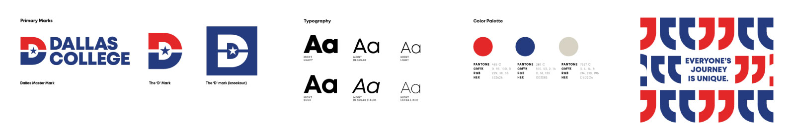
During the course of this project, the new visual identity assets for the Dallas College brand were approved and shared with all partners in Marketing. Based on insights from research and focus groups, the brand team developed a logo and visual style that honored the 50 years of DCCCD history. These assets would provide a foundational visual framework which the home page would be built upon.
UI Design
- Ideate
- Prototype
Through a workshop held with college visual and web designers, we brainstormed approaches on telling the story, using modern web techniques, and refining the look and feel.
We determined the page word count and height would need to be reduced, that the page needed to be cohesive, and real photos of our real college students should only be used.
All the pieces for the layout and UI design of the page were ready. To illustrate the process, the evolution of two of the modules are shown here:
From Lo-Fi to Hi-Fi
The Explore Your Path module would showcase the breadth of options. Here is how the UI evolved:
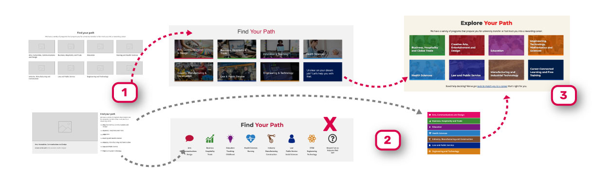
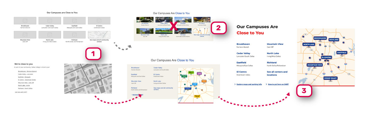
1. Lo-Fi Concepts
We started experimenting with a few different approaches to the module.
2. Experimentation
We evolved some approaches and abandoned others. However, there were some elements of unused concepts that made it into the final prototype.
3. Hi-Fi Prototypes
To ensure visual variety, we chose to continue with modules that complimented each other and created stronger cohesion throughout the page.
Development
I led the production of the HTML and CSS for the home page. Many of the modules and components needed to be written from scratch as they were not yet developed within the design system we were producing at the time.
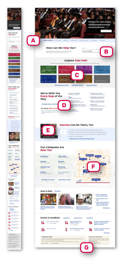
A Design Breakdown
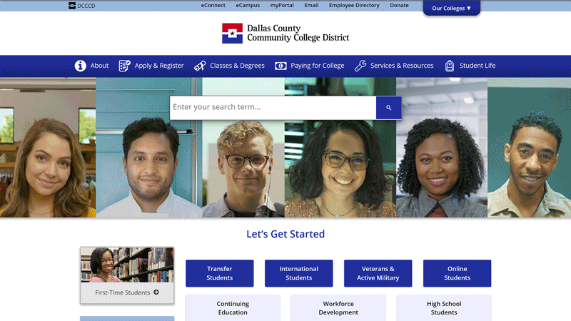
Each of our design decisions were based on insights, goals, or needs defined throughout the process. At the center of the Dallas College story is the student. To show that, the word “you” is included on all headings of the page.
A. Current student quick links: Subtly tucked in at the top, the most visited and searched pages by current students are quickly accessed here
B. How Can We Help You: Dallas College serves a wide range of audiences. While the page is primarily for students, this menu offers entry points for anyone.
C. Explore Your Path: Insights showed that displaying the array of learning and training options was crucial
D. We’re With You Every Step of the Way: A major tenet of the Dallas College story is that they are there to remove barriers and champion student success.
E. Success Can Be Yours Too: With students at the center of the story, a quote highlighting their success helped illustrate that story
F. Our Campuses Are Near You: One of the greatest values of the college is that no matter where you are in the county, there’s a campus or center close to you.
G. Compliance-related content that didn’t serve the story was still included, but was not emphasized.

Results
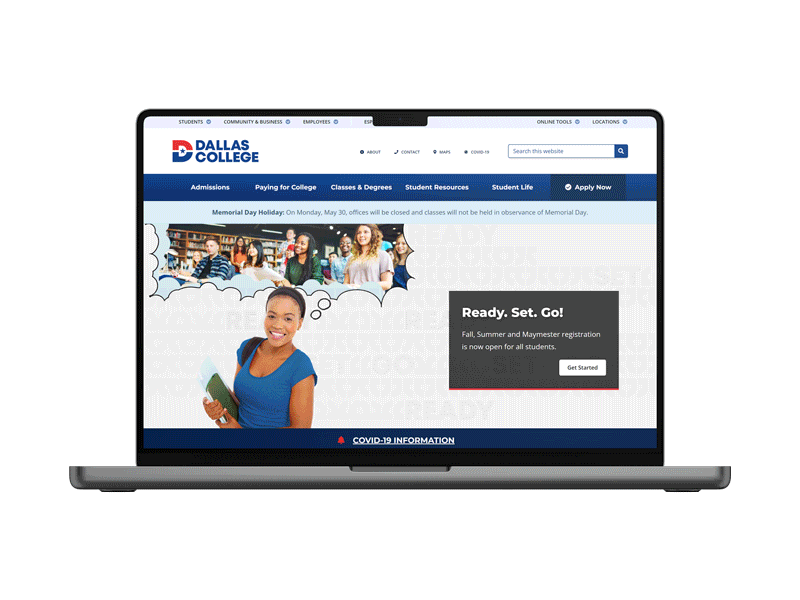
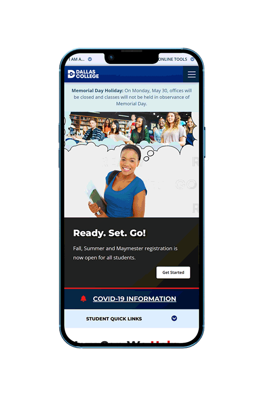
New Dallas College Home Page
Launched Product
Outcomes and Metrics
30%
Faster Load Time
Optimized graphics and cleaner HTML improved page load time.
900%
Increase in Clicks** to Apply and Admissions Pages
Improvement of brand storytelling and updated calls-to-action in the header, footer, and home page increased traffic to key conversion points.
17%
Reduction in Bounce Rate
A drop in bounce right could signify that users were less overwhelmed and more engaged to our value proposition.