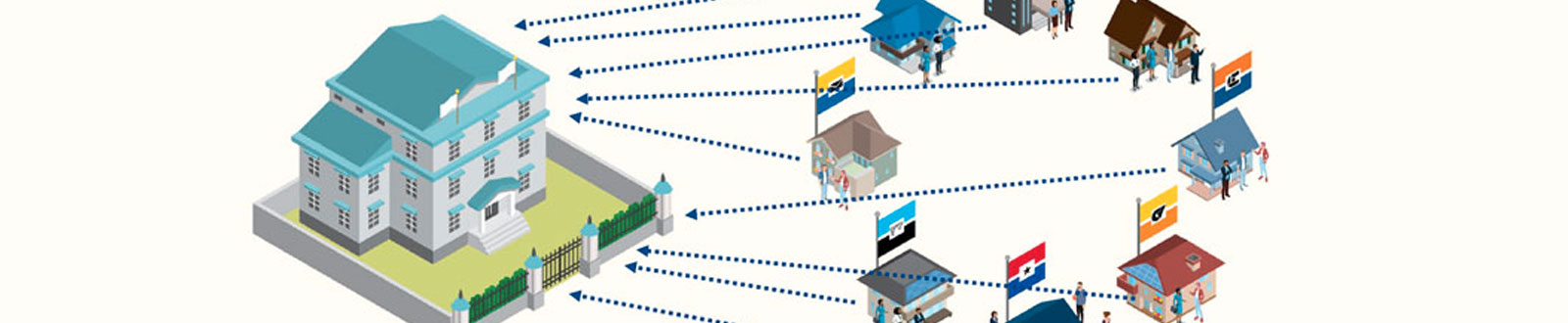
In the aftermath of a chaotic website migration, the eight web teams of the Dallas County Community College District were left to contend with over 1,000 pages of disordered content, redundant information and inconsistent layouts—not to mention failing inter-team dynamics! We realized the only way to strengthen our websites and move forward as a cohesive team was to unify our largely-independent teams around one compelling goal: put the needs of the student at the center of all our work.
This presentation will walk you through how we transformed the marketing pages for 100 programs across 7 colleges from a disjointed mess into a streamlined user experience that provides greater value to students. Along the way we discovered an empathy-driven methodology called Design Thinking. Learn how you can implement its five phases to resolve any creative challenge by:
Read Full Transcript
Good afternoon, everyone. And welcome to my presentation that’s called Empathy and Design Thinking, colon, ’cause you’ve always got to have that subtitle for conference presentations. How Becoming Student-Focused Improved UX, Busted Silos and Built Bridges. And really what this presentation is, is it’s a story. A story how my team and I were able to organize over a thousand really messy mismatched unclear program pages across seven colleges. How we were able to overcome a rushed, and difficult transition for eight college web teams. How we placed empathy at the core of our processes to better understand not only the students but the other teams, my colleagues. And then along the way we discovered, uncovered a process that we soon learned was called design thinking, which is what I want to talk about today. But before we get into the story, and before we start talking about design thinking, just a little bit about me. My name is Luis Merino. I am the Assistant Director of Digital Experience for Dallas College in Dallas, Texas. So I am primarily responsible for the design, usability, strategy for the main flagship website for our college. Now, before July of this year we were actually known as the Dallas County Community College District. And we operated very differently then than we do now. And I wanted to touch on that. So I just want to give you some background as to where we were as a district where we were as a community college system to set the stage for the big project that was ahead of us. So let me take you back to the year 2016. We were actually seven independently accredited community colleges throughout Dallas County. Now, what this meant was is that we actually had over seven, eight marketing departments, with eight marketing directors and eight separate web teams, all serving under their own college presidents who had their own agendas going on. So we were very siloed. So what this meant was that we were actually having eight completely different websites. We used different language, we used different editorial style, we used different designs, completely different layouts, navigation, we were on different content management systems and we went as far as being hosted completely differently. Now imagine that we were all living in separate houses, separate floor plans, separate building materials, flooring, styles, decor. Now for our house guests, which in this example is the students, we saw how the inconsistencies were confusing and even frustrating, especially when a quarter of our students could be attending more than one college at any one time. So, in the fall of 2016 it was determined by the senior executive leadership of the district, the chancellor and his team, that it was time to begin centering our processes and how we worked around the student instead of being so focused and siloed to just individual colleges. So they thought that an easy low-hanging fruit to tackle would be the websites. So we received a mandate in the fall of 2016 that we should align the layout, the navigation, the design of all of our different college websites into one. Oh Oh, and that we had six months to do it. Now, there were some of our colleges that were more open and welcome to the idea of being able to come together, but as you can imagine most of our colleges were not very happy about that decision. Three colleges were already in the middle of their own redesigns. College web staff saw this as corporate coming in and just pushing them out of their houses and forcing them into live into one big house. It was, the feelings were a little bit rough. Meanwhile, we had six months and there were a lot of decisions that needed to be made very quickly. And what ended up happening was a lot of those decisions were done at the district web team level. Now I was on the district web team. And so, that’s the perspective that I had, it wasn’t a collaborative move. The district web team was making a lot of the major decisions and the college web teams didn’t have a whole lot of input into the process. So early 2017, for the most part, we have the house planned out. We have the construction well underway but not only did we have to build the house, but then we had to move everyone’s furniture, belongings, knick-knacks. How were all these things going to come together? We still weren’t exactly clear on that. It was a super fast, super hasty move. Now, if you’ve ever had to move without much notice, chances are your move resulted in something that looked like this. You were just grabbing things, putting them in boxes, putting them in bags, moving them, and then throwing them into a room or throwing them into wherever. That’s the point that we were at. We had all this stuff, all this content, we were like, “We just got to put it in and we got to go. “There’s other things we got to worry about. “We got to make sure the plumbing is working. “We got to make sure that the electrical is set up right.” A bunch of these big functional pieces that we needed to focus on, we didn’t have a whole lot of time to sort through things or organize a lot of the areas. So some of that stuff was just going to have to wait. So then, March 2017, the time comes to launch the website. And to be completely honest, it was a very rough transition. We did not do a good job managing redirects, the search on the new site was not working properly, not all the content had made it. We still had some functional issues, exposed wiring, some walls weren’t painted, and then faculty, staff throughout the colleges were not happy either because some of their stuff was missing or they couldn’t find things or links were different. It was rough. And so we had to focus the next several months on cleaning and smoothening all of that out to the point where our story begins. Eventually a year and a half later, we get to a point to where we finally able to really take a look at some of the other parts of our house. At this point, it was the summer of 2018, most of us were very comfortable now living in this house, the dust had settled, a lot of the bigger pieces were taken care of. It was time to go back into some of those rooms and clean some stuff up. And one of the messiest places in the whole house was this hall with a lot of rooms and a lot of mess. And that hall primarily consisted of our program pages and departmental pages. There were over a thousand and they weren’t cohesive in any way. There was no clear calls to action. There wasn’t any consistency. Some had lots of content, lots of words. Some had led with videos. There was just was no central strategy to any of this. And because the content in these areas was really owned by each of the seven colleges, it was really hard to get everyone on board to fix something there. But that’s what we wanted to do. That’s what we were heading towards. So that was our problem, was cleaning these rooms up. Our messiest, most visited rooms were the program pages. We knew they needed to be cleaned up, they needed to be organized, and they needed to be made in a way where our house guests, our students, would be able to come in and find things that they needed. Included in this was that we knew that our approach to this needed to be differently than what we handled, that migration and transition previously. We wanted this to be everyone had a voice in what was going on. All the colleges, that this wasn’t a district pushed thing. So that’s where we were at, lot of things going on so where do we start? We have all of our pieces here. We have our problem. We have our college web teams. We have the district web team. We have our marketing directors. We have our faculty program coordinators. We have the future students themselves. And we have the content, the information that is actually there. All these different stakeholders and factors into how these pages are going to be redesigned. What do we do? How do we handle this? Whatever we did, we had to put the student at the very center of everything. We had to get on the same page, we had to align ourselves. And the best way to align ourselves was to focus on the student. So as being a user experience professional I know that putting users at the center requires empathy. Empathy we knew was going to be the key to this whole thing. There are lots of tools that are available to marketing professionals and ideas and strategies to employ empathy. One of which is the persona profile. Which is where you create a composite of your students, give them a name, give them some data-driven characteristics. And then you’re able to flush out these characters, these actual people that you’re designing for. We had developed these profiles before this point, but we knew that the discovery and the research that we wanted to put into this project, we needed to align around those persona profiles that we had created. So, what we did was is we developed a set of interview questions and a card sorting exercise, where we took chunks of content and information that were found on our program pages and broke them down into a set of these cards. And we sat down with real students and had them look at these cards, organize these cards, and sort these cards into how these were important and relevant to them. And the students we talked to, each aligned to one of the three persona profiles we were aiming for. So this really helped us not only learn from the students, but helped us understand who they are, what their goals are, and also just sitting face to face with students is just so invigorating to the work that we do, because at the end of the day, this who we’re creating content and experiences for, is the student. So, my team and I, we did several of these interviews across many of the colleges, and then we came back together and we discussed and synthesized the information that was gathered and we saw that there were patterns that began to emerge. There were some pieces of content that were a lot more relevant to our students than other pieces of content. And so we knew what information we needed to deliver to them first, rather than later. So at this point, the district web staff, my team, was able to reach a certain level of empathy for the students. We got to this point we’re like, “Okay, we know what we need to do based on our experiences, “learning from their experiences.” And what we knew what we needed to do at this point is we needed to plug in the college web staff into this process. Now at this point we still hadn’t had a formal meeting or kickoff to this whole project. We were just trying to gather information insights to help us decide how this process was going to even unfold. But we knew that what we needed to do next was to get the college web staff plugged right into that empathy. We needed them to feel and connect with our prospective student. So what we did, one of our ideas in the summer of 2018 when we started this project, was during our kickoff meeting/ workshop, we devised a card sorting exercise, almost exactly like the card sorting exercise we had our students do. But what we did was, we broke – first of all, we invited all of the college web staff to this kickoff meeting, and of course formally invited them to the project. And they all mostly came, it was maybe 20, 25 college web staff. And we broke the big group into smaller groups. We made sure that each of the smaller groups was comprised of staff with different college affiliations. We didn’t want all of one college to be in one group. We wanted collaboration and silo breaking to happen at every level of this project. So we broke them into groups. We had each group perform the card sorting exercise. The thing that we did different was that to each of these groups, we assigned one of the different persona profiles. We gave them the full page profile sheet. We had them read it together as a group. We wanted them to get into the shoes, in the minds of those students, as much as possible. Then we had them do the card sorting exercise. And we also included a profile for one of the faculty or program coordinators because we wanted one of the groups to see it from, not only see it from their perspective, but also we wanted to show the whole group the difference between the needs of our students and the wants of our faculty. And we needed to do both. But we wanted to err on the side of the student needs for sure. And if we could see that contrast, we would know which side to lean toward as we’re going through this process. So that was very much illustrated throughout that workshop exercise. And so this really was fundamental and key to getting the empathy plugged in from the very start and kickoff of this project. Here we were at the beginning, the kickoff meeting. We were at the beginning of this process. We didn’t know what the full thing was going to look like. We just knew where we needed to start, and we knew maybe what the next step would be. And that next step would be to then formalize what it is that our goals are and to define our problem. Define our problem so that we can get closer to a solution that actually works. And out of that kickoff meeting we were able to get college web staff to see that the outcomes from their empathy card sorting exercise matched pretty close to the actual findings from the card sorts that we did with the students. And so at that point, we had buy-in to create a list of requirements, goals, objectives. And so we created a creative brief document that served as the foundation for the rest of the project. We outlined the goals and objectives, target audiences, our requirements, timelines. We really tried to spell out as much of the problem as we could. So again, we could find a solution that fits. So here’s the goals and objectives that we had. One; improve the experience and usability for the student. Two; improve process for maintaining sites through collaboration and communication for all web teams. What this meant was we wanted to clean up the behind the scenes work that goes into maintaining these, and that was a piece of this. We wanted to make our work easier for ourselves in the future. And then third; help programs and departments better meet their marketing and communication goals and connect their goals to the overall marketing goals of our department. Also included was a list of the things, the pieces of content that students were interested in knowing about first. There were pieces of content that were higher of relevance, like tuition, costs. We are dealing with community college students here in a big metropolitan area. What are the entry-level wages for the jobs that these classes and these degrees lead up to? What’s the job demand? Is there growth? Will I be able to find a job? Essentially, those were some of the consistently, the more important things that came up. The least important things; mission statement, accreditation statements, links to professional networks, that was not as important to our students as just like, how much does it cost? How long is it going to take? Those very basic things. So we included that in the design brief so that staff could know which questions students were wanting to answer first. This creative brief framed the process going forward. And it was kind of at this point where we may have discovered an idea called design thinking and that this process could very well fit into that methodology. So, design thinking. What is design thinking? So, there’s this definition from the Interaction Design Foundation, and it is this. It’s a design methodology that provides a solution-based approach to solving complex problems by understanding the human needs involved, reframing the problem in human-centric ways, creating many ideas and brainstorming sessions, adopting a hands-on approach in prototyping and testing. And so these are essentially the main phases steps of this process: empathize, define, ideate, prototype, and test. This was design thinking. But beyond that, design thinking is a completely non-linear process. Which means you could go back a step, you could go back to the beginning, you could circle back through. These five stages are more like phases that your process will have to go through at some point, but it doesn’t necessarily have to be in that order. And design thinking can be used for anything beyond your websites or digital projects. It is a process, a methodology, a way of thinking, a way of approaching problems in a collaborative human-centric way. So, back to our story. Here we are. We’ve started our empathy. Our empathy will be there throughout this entire process. We’ve framed the process with the creative brief, we’ve defined it. We’ve reached a stage now where we ideate. We take everything that we’ve learned, and then we start building out brainstorming ideas and so forth. So we had a creative brief. What we did was we wanted to make sure each college had a chance to really address the creative brief on their own, and then bring back ideas to the group. So we gave each college a couple of weeks to address the problem and really come up with some ideas. And here’s just some sketches that my team and I, we actually took an entire afternoon, I think, and went to one of our campuses, went to a room lined with whiteboards, and we came up with ideas upon ideas. We talked about what the flow should be, how different parts of the program website should operate, the different entry points into the sites, where we’re wanting students to go after they visit these sites, what a preferred flow would be through this site, what the calls to action would be. That’s what we wanted to focus on first before we began the step of creating sketches or layouts, which was also a part of this, but we wanted to attack that journey piece first. And so after a couple of weeks, we all got back together and brought our ideas. Some colleges brought a few ideas, some colleges brought lots of ideas, but we brought all these ideas together, and what we found was that there was a piece to the puzzle from everyone that came. A puzzle that would eventually come together. And this is where the collaboration started to really occur was bringing these ideas all together into one place and figuring out what fit, figuring out what didn’t fit, because a lot of things didn’t fit and that was fine. But a lot of things did fit. With enough ideation and brainstorming to a point we reached where we could begin the next phase of this, which is prototyping. Now what a prototype is, essentially it’s they’re visual representations of the ideas that we have that are quick to create and quick to move. These visual representations can be on paper. We can have paper prototypes as seen on the screen here, we have, in one of our meetings, we brought together some of our ideas, we put them on paper and we color coded some of them to mean certain areas of the page. And we could easily move things around in a group and figure out what fit and what didn’t fit, or what needed to go up here or what needed to go below here. We could sketch a new component, put it on there, we could move things around. So it was very easy to move things around, and that’s what makes prototyping so valuable, is that you can create new ideas quickly or fix or iterate without spending a whole lot of time. And so we can see here more pieces of the puzzle were added to what would eventually become the solution here. We got to a point in our prototypes where we wanted to focus more on the visual design aspect of this. So again, I brought in the people from our web team that are more visual designers and focused on the interface. We brought them together to, again, workshop through some of these ideas. What could this look like? How could this work? And that really helped refine our concepts eventually. You can create prototypes that begin to become, that begin to be more a higher fidelity. We created ours in Adobe XD and here is an example of one of the prototypes we came up with. Where we focus on the major pieces that the students are looking for when they come to the site. And it’s something that we were able to create that looks pretty close to what it will be like when we actually build the page. So here is an example of an earlier idea of the homepage for the sample program site, Prototype A. We were able to throw this together relatively quickly. And as we met further there were things that we needed to go back on. So here we’re already kind of starting the non-linearness of this process. So we go back to some ideating, and we are able to ideate and prototype quickly because of how nimble we can be in a tool like Adobe XD. So I can move from a prototype A which has a certain buttons across the bottom that are kind of bigger and move to a prototype B where the buttons are smaller and more at the top. And then even further move to a prototype C that addresses other issues in the layout. But we can pivot quickly between these, because again, they’re prototypes. So eventually we build out an entire example of a program site in Adobe XD, and we are able to build it so that it does, it’s actually a clickable working prototype that users will actually be able to test out. Testing. Testing is the last real phase of this. And so we wanted to make sure that we had our bases covered in that respect. And so the testing that we did was usability testing. Which is where we take real users, we give them specific tasks to do, and then we observe how they interact with the site. We also ask them to think out loud, “Let us know what you’re thinking “so that we know exactly what’s going through your head.” And so we actually took a couple of videos, screen captures of these usability tests. And so here’s an example of one where we were able to get some confirmation on some of the decisions that we made.
We’ve landed here. This is everything that there is to know about accounting. And you want to know what classes you need to take. How would you go about finding that information?
So first I’m going to start scrolling down the page, and then because my first choice is classes that I’m going to take now, it’s going to be degrees and certificates. And through that I’m going to check which one do I want? Whether I want an associates degree, an assistant certificate, or just a clerk certificate? So of course these prices are given here like time to complete and the cost of tuition. That’s good that I can see it right there. And I know how much time I’m going to invest in that. So for me, I’m going to go for AAS degree.
Again, we were able to know we are on the right path. But in many instances what usability tests show are things that could be fixed or things that you do wrong most of the time, that’s what you’re looking for. What can we fix? So in this next example, we get an insight as to that. Our student here lets us know that the chances of them clicking this video are relatively low.
What’s the likelihood that you would watch that video? Percentage-wise?
15%, because there’s nothing that indicates me to watch this video. It just says, “Meet Ezra Calado” and I don’t know who that is. So of course, I’m not interested in watching that video unless there was something that was like, that would indicate to me that this video could help you understand this.
So there, we got a little bit of insight. If we want students to watch a video we need to contextualize it. They’re not going to just watch a video because it’s there. They need to know why would I want to watch this video? What is this video have for me to offer? So that was a little nugget that we were able to pick up on and are used throughout the entire site. When we post videos, put videos on pages, we want to make sure they’ll give them the proper context so students know why it’s relevant to them. So throughout the process, there’s a back and forth, back and forth. There’s chats, they’re sketches, there’s prototypes that all just go back and forth throughout this whole thing. And eventually we get to a point to where we were able to start launching these, building them out and launching these. And we released our first batch of program site redesigns in January of 2019. Now, here’s on the screen, is the older set of screenshots. You can see very inconsistent. These are all program pages. They just, they don’t work all the same, they don’t look all the same. But as we were going through and fixing these, you can see that now there was consistency, we had clear, focused calls to action. The process was very student-centered. We’re offering the information that they’re wanting, needing to know first. And behind the scenes there were clear, easier ways to manage this. But as you can see in all these screenshots, there is consistency throughout. We wanted students when they land on a program page to know they are on a program page, to know where they can find where the degrees are, where the classes are, what the cost is, what the career information is. We wanted all of those pieces to be in similar familiar places from program page to program page. And so what did we gain from this? What were our outcomes? What were our takeaways? What was the result of this? And of course the biggest piece here was that we ended up with a website that was further more strongly focused on our students. Also behind the scenes, things were cleaner, things were organized. We knew what pieces of furniture belonged where, we know what things belonged where because everything was organized. We knew also, what things didn’t belong in these rooms because we were all on the same page. And so the behind the scenes process was smoother. Then there was the team aspect of this, the teamwork, the collaboration. This really strengthened our relationship, the district’s relationship with the colleges and the colleges with each other. We were meeting semi-regularly, every, I believe, every two weeks at one point to talk about this process, smooth things out, figure things out. So we started spending a lot of time together, and that really helped solidify ourselves as a cohesive unit. These screenshots that are on the screen right now are from a video that we all produced together to communicate and announce the changes to the pages, to the rest of the district. And we were able to do this in a way where everyone could show how they had ownership in the product, and that was really important. And all of this really set the stage for what would happen in 2019 when it was announced that we are moving from seven accredited colleges to one, with seven campuses, that a lot of our processes along across the district would begin to align. And as the marketing department would begin to integrate and come together, as well as the web teams, which is what has happened in 2020. And this process really helped us develop a pattern for addressing issues that really needed to be addressed on our website. One piece after we were done with the program sites, at least designing them, we wanted to focus on the header of the website. So this was the header during that time in 2017, 2018. And we knew we needed to fix it. We knew we needed to make it more clear. And so we went through the process again, we brought a team together, a cross-functional team from even people outside of marketing, in IT, in academics. We brought them into this process for them to be able to provide input. We had more card sorting exercises. We went through that design thinking process all over again to be able to produce a result that was a lot more focused around what the student needed and what the student wanted. And then we were able to really duplicate that process again earlier this year as we moved from the Dallas County Community College District into a Dallas College where we revamped a lot of that top bar menu and options that were really driven by heat maps and analytics. Another big collaborative effort was the redesign of the homepage. Previously, our homepage on the colleges and the district websites was very chunky. A lot, some of it was kind of just like, “Okay, we need this on the homepage. “Oh, they’re wanting that on the homepage. “Let’s stick it down here.” And it just ended up being this collage of mismatched things. Again, there was no central strategy to it, and we knew we needed that strategy when we redesigned the homepage for Dallas College. And I wanted to make sure that that process was as broad and open as possible going into Dallas College. So the redesign of the homepage actually occurred in April. While we were all working remote, we were still able to address this. And so we were able to look at different prototypes. Really before that though, we deviced a strategy of what we wanted the homepage to be. We wanted it to tell the story of Dallas College, who we were and what we are for our students and our community. And we all had a couple of different workshopping sessions where we really defined what those things are, and what those things meant. And we ultimately arrived at this idea that we are here not only to provide classes or education for you, we are here to help you get a better life, we’re here to help the Dallas County community. We’re here to help the local workforce. We are here to help you remove barriers that are in front of you, between you and your education, you and a better job, you and a better life. That’s what Dallas College is about. And that’s what we wanted to focus the homepage on. So we had a lot of wording and a lot of content and strategy around communicating to the student. So before, one of the comments that we had was, the website is very blocky, and it was the homepage before. And so we cleaned that up at the top portion where we just have this “How can we help you?” You could be here for “Just can I get my basics done.” Or you could be here to, “I want to improve some skills. “I want to get a different job. “I want to train my employees.” We offer all these things to so many people in the community. We really wanted to hit on that piece, on the homepage. And so that’s just a small portion of what comprised kind of our “you” focused homepage. But above all, the outcomes that come out of this is just, is the knowledge that empathy is everything. It was at the base and the foundation of this entire process. And we know that as we work with and develop empathy for our colleagues who are in a different silo. Who have different objectives, that if we can achieve that empathy, those walls come down, those barriers come down. And that makes it all the more easier to then focus on the student and vice versa. You focus more on the students, eventually, you and the other person in another department will align yourselves along that goal if you can all really match up on those levels of empathy. And that’s, I think, what I just want to end this presentation on is just the idea that empathy is everything. And if you are able to infuse empathy and infuse students in the work and the designs, and the sites that you do at your own college, it will just make it that much better for them. Because at the end of the day, that’s why I love doing what I do is to make the experience better for the student, make that process of enrolling in college smoother so that they can get right in and improve their life. And, that’s all I got. Thanks for sticking around. And hopefully you got a little bit of nuggets of things that might be able to help you in your own work. And if you want to reach out to me or whatever, questions, comments, gripes, feel free to email me, lmerino@dcccd.edu. That’s D-C-C-C-D.edu. And you can hit me up on Twitter as well @LuisRMerino. Again, thanks for sticking around.
Hi, and welcome back for our live Q&A with Luis Merino. Luis, thank you so much for joining us at HighEdWeb. How are you enjoying it so far?
Hey, it’s been great. It’s very interesting to see how the community is very tight knit. There’s a lot of culture here, a lot of inside jokes. So, it’s really cool.
Well, we’re glad that you were able to join us and hopefully by the end of this some of those inside jokes will make sense, and it won’t be othering that you’re hearing those kinds of jokes and like, “What does that mean?” We have a number of questions from your presentation so let’s just jump right in with them.
Let’s see what we can do.
Chris Blackthorn has asked, “Do you get pushback on doing things for students versus doing things for prospective students?”
We get pushback sometimes. And I think it’s only from certain programs, certain faculty that might be a little bit more used to getting their way, but we, from the beginning our strategy was very student-focused and we were transparent with them that it was, but we were very open to hearing what, probably from the faculty perspective, what that was and making sure including that in the table. I remember earlier on in the process, we had a meeting with one of the faculty members and he brought up a lot of valid points that we had not considered. And so, in going through this process, I feel like bringing someone from the faculty perspective will definitely help to kind of be in there throughout the process to help avoid hitting those situations where you’re like, “Oh, we should’ve considered this.” So.
Dan Thompson asked, “What strategies do you use to counter faculty complaints, if you get any about student-centric focus?” His institution, they get a lot of pushback from faculty whenever they say student-centric.
So the way we were set up previously kind of buffered us a lot from the faculty, because I was at the district level in the district web team and each college had their own web people. And so, the web people at the colleges would get a lot more pushback from their faculty than we would. And I think their go-to was kind of just like, “We can’t. “District, district is telling us to do this.” And so, we definitely wanted to make sure that that wasn’t their go-to answer, that their response to faculty was “We know, we’re doing this for the students. “These are the things that the students are wanting to know.”
Thank you Matt Ryan asked, “Can you share the creative brief doc “that you showed within the slides?”
Yeah, I mean, certainly. I mean, it’s pretty basic, but absolutely.
Excellent. Beth Outlaw wanted to know, “Did you quantify high versus least relevant for your leadership audience? And if you did, how did you present that data to them?”
So that’s a good question. We didn’t actually get a whole lot of pushback on what those priority items were. We certainly had all the information collected and if they did have feedback, we know we definitely would have come back to them with what our findings were and in as visual a way as we possibly could ’cause sometimes leadership and executives don’t read, but that’s fine.
I’m getting, unfortunately my internet connection is getting a little unstable. So there may be a little gap between me reaching out to you and stuff but…
That’s fine.
George Sackett wanted to know, “Did your user testing also include users with accessibility issues?”
Good question. No, it did not, regrettably. I would say since we started that project in 2018, we’ve come leaps and bounds with, we were already pretty solid accessibility-wise, but leaps and bounds in how we address accessibility issues and that’s something going forward, we absolutely want to make sure that that’s included. I know we have done accessibility usability testing separately from this project. We have sat down with some people who had vision impairments to see how they use the website. Because, and I would encourage anyone on any web team anywhere to do that. Because seeing how these users interact with your website, you see it in a completely different way, and it just opens your mind as to that new dimension of how you create websites, ’cause you’re not just creating websites for people with perfect vision, you are trying to lay a foundation of content that can be accessible in all these different ways. So, good question.
Chelsea Smith asked, “Can you talk more about working with faculty on UX and design? “They often have very different needs and points of view than students or marketing.”
And this comes back to like, in the sense I’m getting, there’s a bunch of questions about faculty. Faculty is an issue because they tend to have a whole lot of sway from what I can see. Like I said, traditionally, I haven’t worked directly a whole lot with faculty. Going forward, that will definitely change because of how we’re structured now. So I know that in this process, I did reach out to a couple of faculty to get their feedback. That didn’t pan out, and I would have liked it to, again, to include that in the process. But if we were getting any pushback from faculty, I think again, it was just trying to explain to them our process and how we got to where we got. But yet at the same time listening to what they have to say and seeing if we can provide solutions to their problems that is still in line with being student centric and student focused.
Thank you. Maurice Hopes asks, “Your update of visuals look great.”
Thank you.
“Did you have any regional colleges that preferred the old system and look? And if so, were you able to, how did you convince them that the new system was better?”
I don’t think we got a whole lot of complaints about the design of it. I think the issues were because again, how we were structured and I didn’t really touch into this in the presentation, but the way the website was set up is super unique and customized to a point that it was a very specific platform because we were essentially serving, it was actually one main website. That depending on the URL that you were using to access it it would hide content a certain way and, or, and change the theming and styling and the header and the footer certain ways. So there was more pushback, I think, about how when you went to a program page on a certain college, it was content that was more generalized and specific to the student as opposed to like, “Here’s what we’re doing at Cedar Valley College in the music program.” ‘Cause that’s what they were wanting. They were wanting their information more up front and we provided a semi solution for that by giving a space and a block on that homepage that was completely customizable to each of the campuses. So we definitely took that into effect. So it was, I think the issues we ran into, was less of the design and more of just how we were operating. Which just goes to show why merging into one college is going to be all the better for the students.
Excellent. Sven Aas asks, “Whoa, that institutional merger is a hell of a punchline. Did the advocates of the website unification project know it was coming?”
So I’m not sure I understand the question but I can take a stab. So the merger, if we’re talking the first merger, like the one that happened a couple of years ago, did they know it was coming? Yes, but probably not as good as, they could have been better informed because when that switch happened, there was a lot of problems. There was a lot of people complaining, and a lot of people confused this to kind of what the context was. The next merger, the one that’s we’re currently in I think everything is changing so much, and leadership and structure is changing so much that there, I think people are kind of worried more about what’s going on in their own worlds than kind of what’s happening on the website. But that being said, we had a lot more time for this one and a lot more work, and we learned a lot from our first one that we were able to kind of plan for in this next one. I hope that answered the question.
I think so. Nina Roby asks, “Did you have any issues around organizing and naming the data related to programs? I’m assuming that the information was dynamically populated. Did you have a central database? Was there consistent naming conventions? How did you work around those?”
So, we were not as dynamic as we would, and it’s kind of embarrassing to admit how static we were and we still are. I mean, we’re moving more and more towards having dynamic pieces. And so in that process, I think, the naming of the programs is very much outlined by our catalog. Our course catalog outlines the specific namings of the programs, the specific pieces inside of them. They’re, I think, the things that we messed with language-wise were so generic or not specific to a program that I don’t think people took issue with it, but anything that was very specific there, we just stuck to whatever was in the the course catalog.
And one final question also from Matt Ryan, “Where did you get those awesome graphics?”
They’re just from Adobe Stock. I took the graphics and of course I customize them and made them however to make the presentation. But yeah, Adobe Stock.
Unfortunately we got what? We got eight minutes. I have one more question that came in maybe we can do it very quickly. George Sackett asks, “Do you worry about keeping the representation of each campus balanced or more campuses more active than others with similar programs?”
So I’ll answer this question two ways. One, in the old world that we lived in, yes, there’s always the politics of how we balance the different colleges. And yes, some colleges were bigger than others and some were a lot smaller. And that affected how they were staffed web-wise and all that stuff. So there was always that juggling balance, but being at the district level we learned, I’ve been here for five years, I learned pretty quickly that there was that balance to always maintain so that we didn’t hit that political roadblock. Now, the locations, the seven colleges, the actual locations of those colleges is a whole lot less emphasized than it was before. Because now we’re circling everything like taking all of our academics. It’s now being housed in one area. We’re taking all our student services. They’re all housed in one area, and not physically, but organizationally. And so our campus locations now are just kind of locations, they’re locations, they’re places, they will each kind of still keep their culture. But this was something that when we were coming into the new new website was how do we… ’cause on the old old website, we had logos and icons that we could use for each of the locations to easily identify some locations from other locations. And so when we were in this new website process we had meetings with our branding team that we were working with an agency to create the new branding for Dallas College. And they were very much, what the instruction they received, and then, in turn the instruction they’re giving is that the branding should all be cohesive. We’re one college now, and so having visuals or any kind of imagery that ties back to the campuses or the old culture should be diminished as much as we possibly could. There was one landing page for each of the campuses that we were a little bit more flexible with on our new site but overall, really the campus and the college locations, they’re just locations now. So hopefully that answered the question.
Absolutely, I think it did. Luis, it was so much of a pleasure for me to have you here today. I’m so glad that you were able to join us.
Glad to be here.
Thank you so much. We have about five minutes until the top of the hour. For the next hour we invite everyone to go and visit our sponsors in the expo hall. You can also use the hop in networking feature to reach out to other people. It’s a great time to connect. And I did that yesterday, and it was a great way to just touch base with people and to share some of those bits of knowledge that you’ve learned today because I’m sure all of our brains are full.
Question about that. When you do the networking, do you just hop on and it’s one-on-one with another person, or what is that?
It is one-on-one with another person.
Interesting.
So when you go in, it’ll test your microphone and your video, you’ll click the button, it will wait a few seconds, and then you’ll hop on with another person. I believe it’s set to five minutes discussion, and then at the end of that, then it jumps off and it takes you to the next person. So it’s completely random how it works, but I had a lot of great conversations with people yesterday.
Interesting.
I highly encourage it. And of course, visit our sponsors. We wouldn’t have been able to have done this conference at all this year without their support and help. They, it was why we were able to give it to you for free this year. And so, please go and show them some love. And we’ll see you again after that at the start of the hour after this one for our next session. And please fill out your conference evaluation forms. I should remember that as well. Go to your hop in chat and fill that out. We appreciate that feedback.